Sales of The Great Way trilogy have lagged pretty significantly, and while I’m working on my new project, I thought it would make sense to do some advertising.
Buying book ads isn’t the usual thing, but I keep hearing that it does well for other self-publishers, and I’m not averse to spend a little money as long as I make back more than I spent. However, before I put anything online, I thought I’d ask for feedback on the ads themselves as well as the landing page.
My son made these ads as part of a homeschool project. He’s fourteen. Please be gentle.

Ad number one

Ad number two
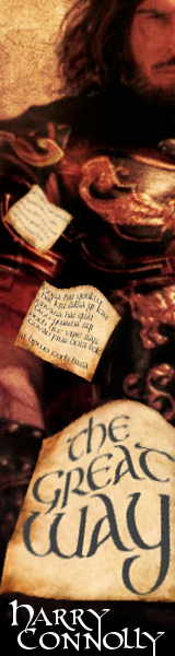
Ad number three
I know there’s not a lot of data there, just images and a little text, but it’s supposed to be intriguing enough to entice a click. Readers who go for the ad will arrive at this landing page. Input on that page would also be most welcome.
I’m planning to run them through Project Wonderful, probably at the forums for OOTS. I’m not sure where else. It depends on how things go. I’m told Facebook is a useful ad space, but I’m not in a hurry to go there.
Comments on this blog are usually turned off, but I’ve tried to turn them on for this post. WordPress can be cranky about this stuff, though, so if you find you can’t (or don’t want to) offer your comments below, you can tweet them at me @byharryconnolly or post them to my LiveJournal, Facebook, or Google plus pages. If you’re old school (or prefer privacy) you can email me at harryconnolly at sff dot net.
Thanks for your help.
Cool. It seems like I got comments to work (for a change).
I like the first banner and the column ad, and I think the second banner should show Tejohn’s eyes rather than his mouth. You could also make another column ad with Cazia, to have more variety when cycling the ads?
The landing page is fine, imo.
(thoughts on the landing page, your mileage may vary, take with grain of salt, accept no wooden nickels)
Make the images on the landing page clickable.
People like to click on images. Send’em to Amazon.
Move book store links up *under* the images. Scrolling to find links bad, easy clicks good.
As for the ads, they look good so congrats to your son he did good work. Honestly, I would’ve done the same thing with the size given to me.
I’d use ad 1 and let’em use images from all the covers. Thankfully you’ve got plenty to choose from. Cover 2 and Cover 3 def have striking images and can be placed to get the text in there.
Projectwonderful is a good idea since they have several different ad sizes available.
This last suggestion is a personal nitpick and is probably (?) a direct result of your ongoing problems updating the website: why not create the landing page as a straight up WordPress static page? i.e. websitename.com/the-great-way The index.php in the address line isn’t really needed, right? (like I said, it’s a personal nitpick, ignore it if it’s direct result of updating the website.)
I agree with the other comment, give us eyes rather than mouth on #2, and it works. #3 is great — I’d click on that. Your son’s using his school time well, hope he was graded appropriately. :)
I like 3, then 1, then 2. None of them are bad, that’s just what catches my eye.
Thanks to everyone who has offered advice so far, whether here or on my other social media. I’m taking the kid out of the apartment for the day, so I’ll check new messages when I get back.
Some of the copy on the landing page reads more like it’s aimed at a publisher or agent than a reader. Specifically: “One of the long-standing tropes of epic fantasy is the Fallen Empire: a nation that once ruled most of the known world but has since vanished, leaving only scattered ruins (and a common language for the characters to speak). Essentially: Rome.
This is the story of the fall of one of those empires.”
Take that out entirely, as well as, “Here’s the description from the back of the first book.” Trust that description to do its job, as well as as the review blurbs.
I would also make each of the cover images at the top of the page a link wherever you want people to buy the books. Or at least to the free sample chapters.
For landing pages in general, I found this has some good, free advice. They’re also trying to sell you on using them to do stuff for you, but that doesn’t diminish the good, free advice.
http://thelandingpagecourse.com/landing-page-101-intro/
I like #1. The text is readable, the images have broad appeal to fantasy readers, the design has good balance (imho).
I had some reservations about the landing page; I think Brady Sylvester covered them nicely.
I agree on the eyes as well. And saying it’s only about the fall of an empire sounds depressing; it’s about the fall of an empire and the people with the determination to keep fighting for civilization, building something better in the ruins.
I like the first ad best. It has nice balance and contrast, and the faces help draw the eye to the text.
I don’t like the second ad, mainly because the text looks wonky to me. The changes in the font aren’t working, for me.
I like the third ad also, but again, the text isn’t working for me, but the reason why is different this time. I think the writing on the closest piece of parchment needs to be darker, because it’s the same darkness as on the middle-distance piece of parchment. Because that middle-distance piece is more detailed, it creates an impression that it’s closer than the nearby piece of parchment is.
That is to say, objects nearby should look more detailed and more vividly coloured than objects that are farther away. The text on the nearest piece of parchment seems to violate that rule relative to the middle-distance piece. The text on the closest piece should be darkest and most crisp-edged.
I like the visuals for the landing page, because you have great covers. However, the first two paragraphs of text read as, “Here’s why my books are a lot like other books you’ve read”, and that’s not particularly enticing.
Your cover description is what I would suggest you lead with, because it’s designed to be the thing that makes readers want to crack open the book and find out what happens.
I’d suggest putting the testimonials next, then some rah-rah encouragements for the reader to get excited about this book (think in terms of: What would a friend giving a recommendation say to the reader? e.g. “This book has rip-snorting action and brave but engagingly-imperfect characters.”) Then, finish with the link to read sample chapters.
That way, you’re progressing from “ooh, pretty pictures” to “hey, interesting premise” to “gee, other people like this book already” to “hmm, I think I’d like to read a bit of this” to “I am now reading a bit of this”.
The final step, however, is you want to slide them from reading the sample chapters to buying the book. So I’d recommend you put a link to your sales sites on EACH of the sample chapters you’ve posted. Something like:
“Buy your copy of THE WAY INTO CHAOS (link) now
OR
Read Chapter 2 now (link)”